Lakoma Studio Logo
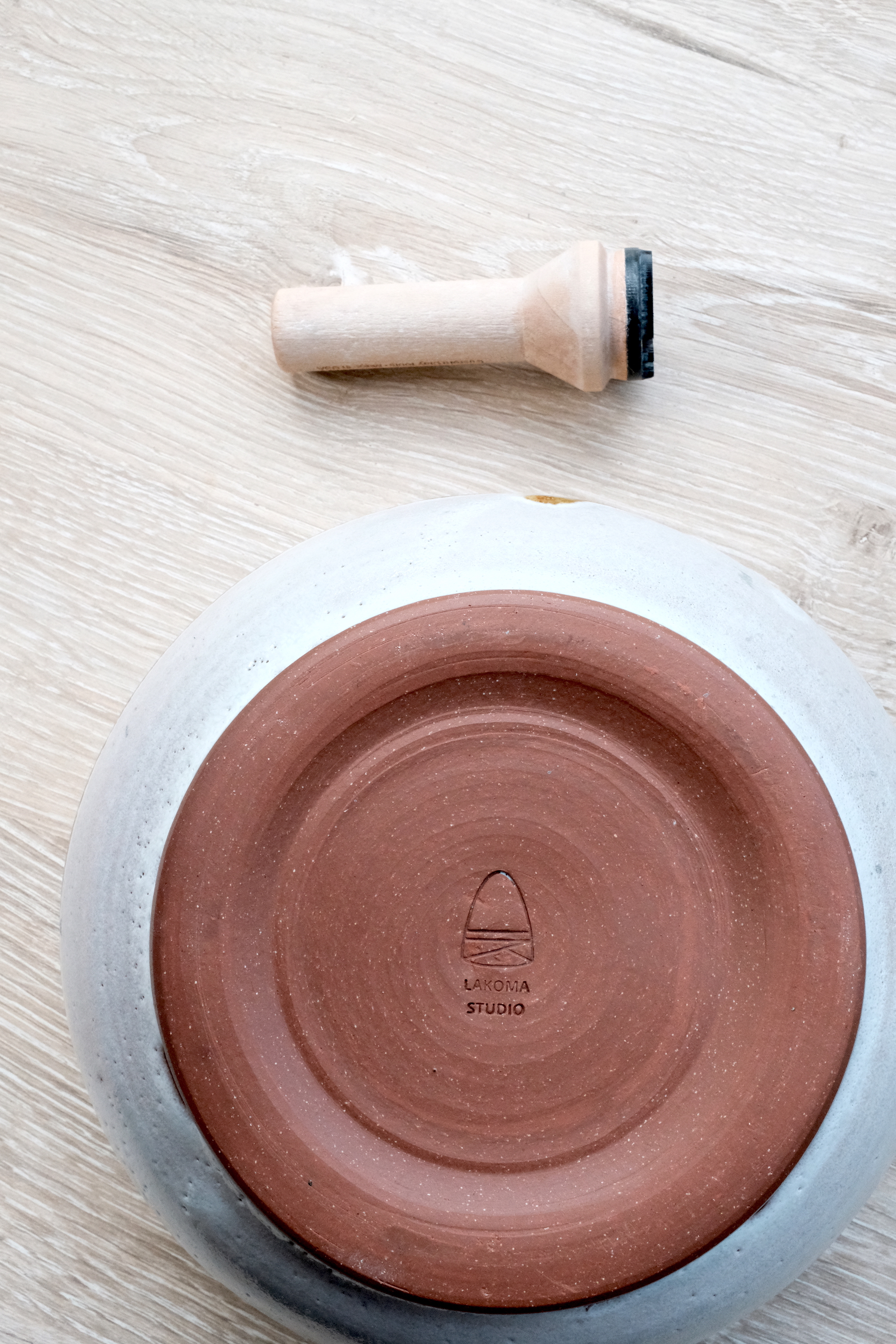
In early 2016, I realized that the pottery I was making sometimes scratched the table due to my crudely carved name on the bottom of each piece. Having a professional clay stamp laser-cut would be a good idea, so I set out to design an icon that could be used to best brand Lakoma Studio.
The first iteration was pretty uninspired. I wanted the full name "LAKOMA STUDIO" on the bottom for sure, and then doubled down by incorporating an intertwined "L" and "S". The three dots are meaningful to me personally. I ran with this design for about three weeks before deciding that I ultimately wanted to redesign the logo with something more personal to myself with a more fluid, less rigid feel.
LAKOMA STUDIO LOGO - FIRST TRY

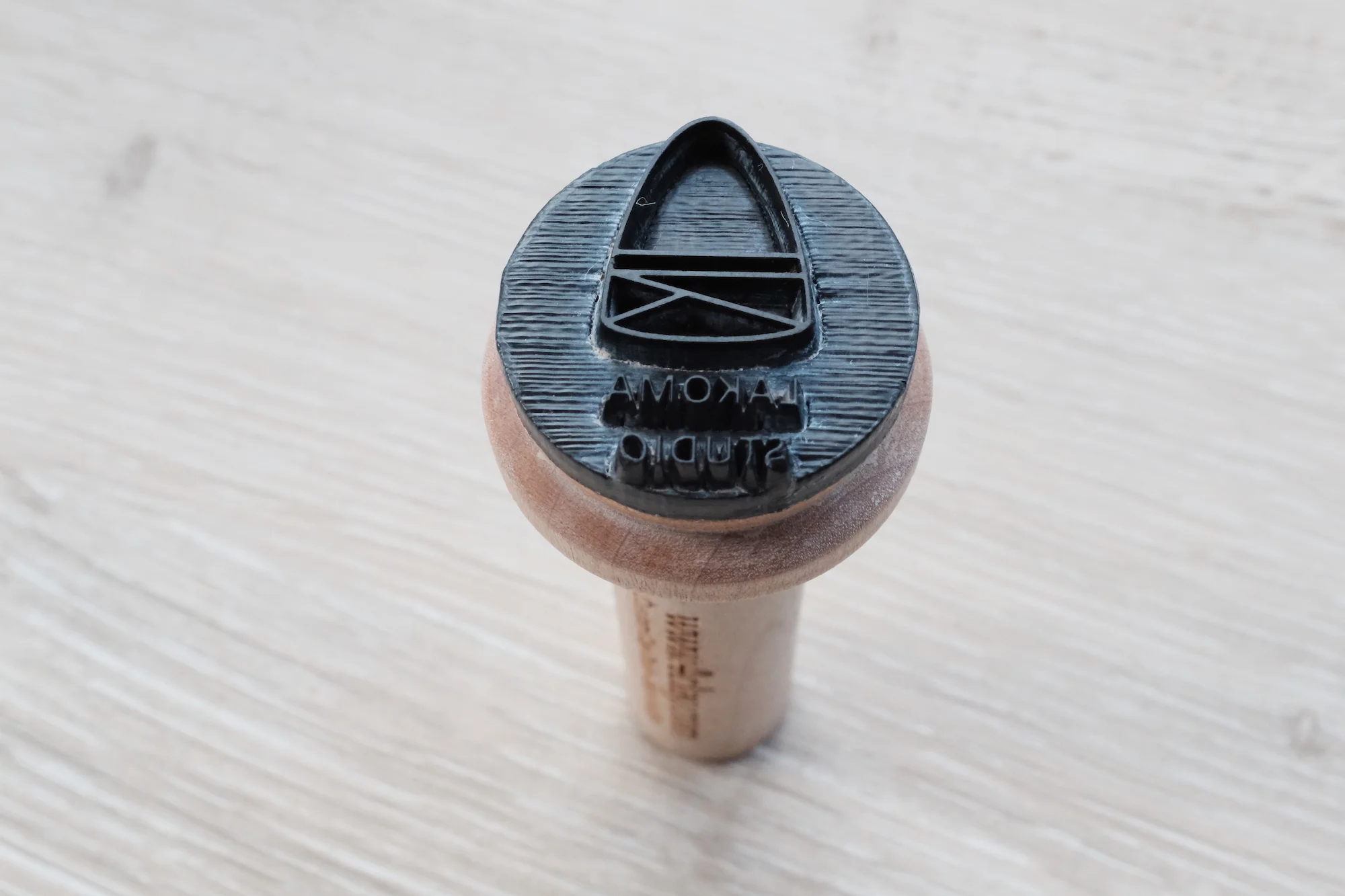
I sketched out a new version that incorporated my initials in a rounded, fluid form. I wanted the lines to connect and form a shape that felt bounded, cyclical and ever-moving with opportunities for variation and different paths. And I wanted the embedded stamp on the bottom to reflect the same feeling of intent that I had put into the piece. I was happy with the outcome, and currently use the following logo as the Lakoma Studio icon throughout my branding.
LAKOMA STUDIO LOGO - FINAL